
Templates
MDX component placeholders
Copy-paste placeholder snippets for every MDX component in the Datamotive docs system, each with a one-line explanation of what it is and when to use it.
- Product
- Datamotive Platform
- Version
- v2.0.3
- Documentation status
- Draft
- Last updated
- Updated
- Reading time
- 4 min read
Every component now includes a live, interactive example and source you can copy into a new page. Replace each [PLACEHOLDER] with your content.
Live component gallery
The examples below are rendered by the same components used throughout the documentation. Tabs, links, copy buttons, and other controls are interactive.
Inline code
Sync status values render as single, unbroken chips: init-success and in-sync stay whole even at a line end, and a spaced token such as Pending CSP Validation keeps one continuous background. Tag the resource Protected-By-Datamotive, or the full pair Protected-By-Datamotive: Datamotive protected resource, without the chip splitting across fragments.
Long-token fallbacks: very-long-status-name-with-multiple-segments, a path like resource/group/workload/checkpoint, a URL https://api.datamotive.io/v1/protection-plans/checkpoints, and a flag --recovery-network=isolated-test move whole to the next line, and only wrap inside the chip when wider than the whole column.
Callouts
Steps, tabs, and code
Choose the plan
Open Protection plans and select the workload group.Start validation
Select Run test and choose the isolated recovery network.Confirm health
Wait for every workload to report Ready.
curl https://api.datamotive.io/v1/plans$ dm plan validate --name production-dr
Select virtual machines
Choose the VMs to recover and the recovery source:
- Latest — recovers from the most recent replicated copy.
- Point In Time — recovers from an available checkpoint; pick a common checkpoint for all VMs or per-VM checkpoints.
A step whose title is long enough to wrap onto a second line at tablet and mobile widths, keeping the marker centered on the first line
Marker stays centered on the title's first line when the title wraps.Step containing a table
Feature Status Since Recovery testing GA v2.0 - An untitled step: body copy starts at the marker row, with statuses like
init-successaligned to the sentence baseline. Final step
The vertical guide line ends above this marker — nothing continues past the last step.
Cards, links, and badges
Quick start
Deploy the platform and run your first replication.
Create a DR plan
Group workloads and define recovery behavior.
defaultbetasupporteddeprecatedrequiredoptionalnewupdatedv2.0.3
Read the Datamotive website.
API and tables
| Parameter | Type | Required | Description |
|---|---|---|---|
| name | string | required | Unique protection-plan name. |
| rpo | duration | optional | Target recovery point objective. Default: 15m |
| Platform | Replication | Failback |
|---|---|---|
| VMware | GA | GA |
| Azure | GA | beta |
| Source | Target | Status |
|---|---|---|
| VMware | Azure | Supported |
| Feature | Standard | Enterprise |
|---|---|---|
| Automated failover | Manual | Included |
| DR drills | Monthly | Unlimited |
| Feature | Status | Since |
|---|---|---|
| Recovery testing | GA | v2.0 |
| Symptom | Likely cause | Action |
|---|---|---|
| Node is offline | TCP 443 is blocked | Update the firewall rule and retry. |
| Requirement | Value | Notes |
|---|---|---|
| CPU | 4 vCPU | 8 vCPU recommended. |
| Memory | 8 GiB | 16 GiB recommended. |
| Term | Meaning |
|---|---|
| RPO | Maximum acceptable amount of data loss measured in time. |
| Job | State | Detail |
|---|---|---|
replicate-042 | healthy | Last run completed in 4 minutes. |
Files, images, and media
- docs/
- getting-started/
- quick-start.mdx
- _templates/
- mdx-template-guide.mdx
- getting-started/
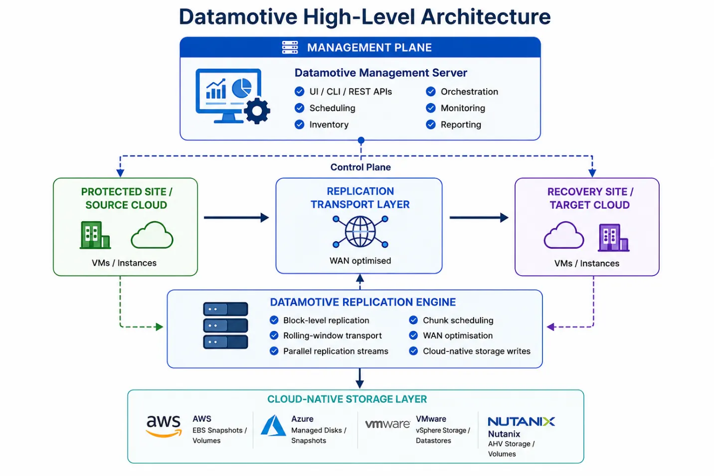
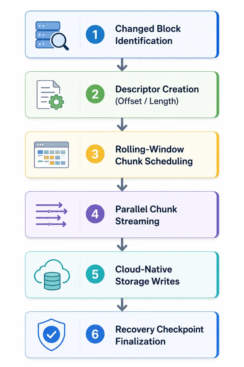
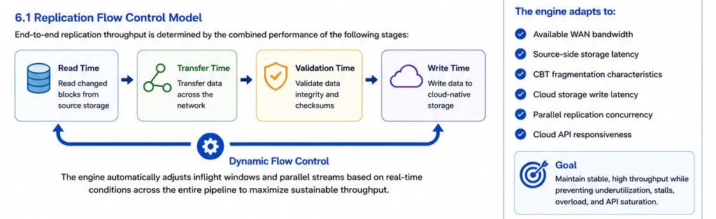
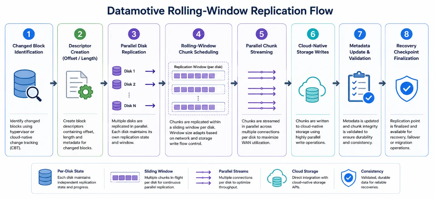
Navigation and metadata
Related docs
Next steps
Last updated July 17, 2026
Math and academic content
Inline formula:
- 1
Start with the event and latest recovery-point timestamps.
- 2
Subtract the timestamps.
Frontmatter
What it is. The YAML block at the very top of every .mdx file. Drives the H1, sidebar entry, search index, and SEO metadata.
When to use it. Always — every page in src/content/docs/ must have a complete frontmatter block.
---
title: "[Page title — under 60 chars, primary keyword near the start]"
description: "[1–2 sentence summary, under 160 chars. What will the reader find and do?]"
section: "[Section label — must match _config.ts]"
category: "[Category label — must match _config.ts]"
product: "Datamotive Platform"
version: "2.0.3"
status: "draft"
sidebar_position: [integer]
tags:
  - [tag-one]
  - [tag-two]
  - [tag-three]
keywords:
  - [search phrase one]
  - [search phrase two]
last_updated: "[YYYY-MM-DD]"
---
Intro paragraph
What it is. The first paragraph after the frontmatter, with no heading above it. Tells the reader what the page covers and what they will be able to do after reading it.
When to use it. Always. Never start a page with a heading — the H1 is auto-generated from title.
[1–3 sentence intro. State the topic and the outcome. Example: "This page walks you through scheduling, executing, and validating a disaster recovery drill without touching production workloads."]Inline code
What it is. Plain markdown backticks. They render through the shared InlineCode chip — one continuous background, no mid-token line breaks, safe wrapping for very long tokens.
When to use it. Status values, tags, file names, commands, and any literal string: init-success, in-sync, Pending CSP Validation, Protected-By-Datamotive: Datamotive protected resource.
Wait until each VM shows `init-success` or `in-sync`.
Tag the resource `Protected-By-Datamotive: Datamotive protected resource`.
Do not hand-roll code styling — these bypass the shared chip and will drift:
{/* ❌ wrong — custom span instead of backticks */}
<span class="custom-code">init-success</span>

{/* ❌ wrong — a fenced block for a single inline token */}
```
init-success
```

{/* ✅ right */}
The status is `init-success`.
Callout
What it is. An inline coloured box that surfaces important information beside prose. Every variant shares one structure (icon column, title, body); a variant only changes the accent colour, background tint, icon, and default label.
When to use it. When a single key point would be missed if it stayed inline. Use sparingly — every extra callout costs the reader's attention. Variants: info, note, tip, success, warning, error, prerequisite, security, configuration. (type is a legacy alias for variant — both work.)
<Callout variant="info" title="[Short title]">
  [One or two sentences. Keep it tight — the title carries most of the meaning.]
</Callout>

<Callout variant="prerequisite" title="Prerequisite">
  At least one replication job has completed successfully for each VM,
  with sync status `init-success` or `in-sync`.
</Callout>

<Callout variant="security" title="Least privilege by tagging">
  [Permissions, tagging, or hardening guidance.]
</Callout>

<Callout variant="configuration" title="[Configuration note]">
  [Behavior driven by saved configuration or checkpoints.]
</Callout>

<Callout variant="success" title="Verified">
  [Confirm the reader completed a step correctly.]
</Callout>

<Callout variant="warning" title="[What's at stake]">
  [Side effects the reader needs to know about before continuing.]
</Callout>

<Callout variant="error" title="Action required">
  [Blocking issue or destructive action. Keep this very short.]
</Callout>

<Callout variant="tip" title="Tip">
  [Optional tip or shortcut.]
</Callout>
Do not build one-off callout markup:
{/* ❌ wrong — ad-hoc div instead of the shared component */}
<div className="random-callout">Remember to validate the plan.</div>

{/* ✅ right */}
<Callout variant="note" title="Validation">Remember to validate the plan.</Callout>
MinimumVersionCallout
What it is. Specialised callout that flags a version requirement.
When to use it. Immediately before any step or section that requires a minimum product or CLI version.
<MinimumVersionCallout version="[vX.Y.Z]">
  [Explain what requires this version. Example: "This feature requires v2.28.0 or later. Check your version with `dm version`."]
</MinimumVersionCallout>
UnsupportedPlatformCallout
What it is. Specialised callout that flags a platform restriction.
When to use it. When a feature does not work on a given OS, architecture, or hypervisor.
<UnsupportedPlatformCallout platform="[Platform name]">
  [Explain the restriction and any planned support. Example: "The installer targets x86-64 only. ARM support is planned for a future release."]
</UnsupportedPlatformCallout>
RequirementCallout
What it is. Callout that lists prerequisites the reader must satisfy before starting.
When to use it. At the top of any guide or tutorial under a ## Prerequisites heading.
<RequirementCallout title="Before you begin">
  - [Requirement one]
  - [Requirement two]
  - [Requirement three]
</RequirementCallout>
Steps and Step
What it is. A numbered procedure with a vertical guide rail. Each <Step> has a short title and a body that can contain any MDX content (prose, code, callouts, nested tabs).
When to use it. Any multi-step task where the sequence matters. Prefer this over 1. 2. 3. numbered lists.
<Steps>
  <Step title="[Step one — short verb phrase]">
    [1–3 sentences explaining what the reader does and why.]

    ```[language]
    [command or code]
    ```
  </Step>

  <Step title="[Step two]">
    [Body. Use nested <Tabs> for OS or language variants.]

    <Tabs label="[Tab group accessibility label]">
      <Tab title="[Option A]">
        ```[language]
        [code]
        ```
      </Tab>
      <Tab title="[Option B]">
        ```[language]
        [code]
        ```
      </Tab>
    </Tabs>
  </Step>

  <Step title="[Step three]">
    [Body.]

    <Callout type="success" title="Verified">
      [How the reader confirms the step worked.]
    </Callout>
  </Step>
</Steps>
Tabs and Tab
What it is. A tabbed group where each tab holds an alternative version of the same content.
When to use it. OS-specific commands, SDK language variants, or deployment-mode options. All tabs must cover the same action.
<Tabs label="[Accessibility label — not shown visually]">
  <Tab title="[Tab label — 1–3 words]">
    [Content — prose, code, callouts, anything.]

    ```[language]
    [code for this variant]
    ```
  </Tab>
  <Tab title="[Tab label]">
    ```[language]
    [code for this variant]
    ```
  </Tab>
</Tabs>
CodeGroup
What it is. A tabbed block where every tab is a single code sample in a different language.
When to use it. When only the code differs across languages and there is no surrounding prose. If tabs need prose, callouts, or mixed content, use <Tabs> instead.
<CodeGroup>
  <Code label="[Language A]">
    ```typescript
    [code]
    ```
  </Code>
  <Code label="[Language B]">
    ```python
    [code]
    ```
  </Code>
  <Code label="curl">
    ```bash
    [code]
    ```
  </Code>
</CodeGroup>
TerminalCommand
What it is. A styled single-line command block with a $ prompt and a copy button.
When to use it. For one-liners the reader is expected to run verbatim. Do not include the leading $ — the component adds it. For multi-line scripts use a fenced ```bash code block.
<TerminalCommand>
  [single shell command — no leading $]
</TerminalCommand>
Card and CardGrid
What it is. Linked tiles pointing readers to other docs pages. <CardGrid> lays them out responsively.
When to use it. At the end of overview pages, getting-started pages, or under a ## Related pages section. Always use internal /docs/ paths.
<CardGrid cols={2}>
  <Card
    title="[Linked page title]"
    description="[One sentence — what will the reader find there?]"
    href="/docs/[section]/[page]"
  />
  <Card
    title="[Linked page title]"
    description="[One sentence — what will the reader find there?]"
    href="/docs/[section]/[page]"
  />
</CardGrid>
Use cols={3} only on section overview pages that have 6 or more short entries.
ButtonLink
What it is. A link styled as a call-to-action button. Supports a variant="secondary" for a quieter style.
When to use it. End of overview or getting-started pages, to point the reader at the next clear action.
<div className="flex flex-wrap items-center gap-3 my-4">
  <ButtonLink href="/docs/[primary-target]">[Primary action label]</ButtonLink>
  <ButtonLink href="/docs/[secondary-target]" variant="secondary">[Secondary action label]</ButtonLink>
</div>
Badge and VersionBadge
What it is. Inline status chips for use in prose or table cells. <VersionBadge> is a specialised badge for version numbers.
When to use it. Inside sentences or table cells to communicate status at a glance. Variants: default, beta, supported, deprecated, required, optional, new, updated.
{/* In prose */}
This feature is <Badge variant="beta">beta</Badge> as of <VersionBadge version="[vX.Y.Z]" />.

{/* In a table cell — see SupportMatrixTable for the full pattern */}
{ status: <Badge variant="supported">GA</Badge> }
ExternalLink
What it is. A wrapper for third-party URLs that adds the external-link icon and the correct target and rel attributes.
When to use it. Every external URL. Never use a plain <a> tag or a Markdown [text](https://...) link for external URLs.
<ExternalLink href="[https://example.com]">[Link text]</ExternalLink>ParameterTable
What it is. A specialised table for API or CLI parameter references.
When to use it. Whenever you document a function call, REST request body, CLI flag set, or config file schema.
<ParameterTable
  rows={[
    { name: '[param]', type: '[string|integer|boolean|duration|...]', required: true,  description: '[What it controls.]' },
    { name: '[param]', type: '[type]', required: false, default: '[default value]', description: '[What it controls.]' },
  ]}
/>
APIEndpoint
What it is. A method-and-path chip styled to show an HTTP endpoint.
When to use it. Place immediately before the <ParameterTable> for an endpoint's request body.
<APIEndpoint method="[GET|POST|PUT|PATCH|DELETE]" path="[/v1/resource]" />

<ParameterTable
  rows={[
    { name: '[param]', type: '[type]', required: true, description: '[What it controls.]' },
  ]}
/>
SupportMatrixTable
What it is. A platform-capability grid with badge cells.
When to use it. When you need to show which capabilities exist on which platforms (often with Badge for status).
<SupportMatrixTable
  columns={[
    { key: 'platform',    label: 'Platform' },
    { key: 'capability1', label: '[Capability one]' },
    { key: 'capability2', label: '[Capability two]' },
  ]}
  rows={[
    {
      platform:    '[Platform name]',
      capability1: <Badge variant="supported">GA</Badge>,
      capability2: <Badge variant="beta">beta</Badge>,
    },
    {
      platform:    '[Platform name]',
      capability1: <Badge variant="supported">GA</Badge>,
      capability2: <Badge variant="deprecated">deprecated</Badge>,
    },
  ]}
/>
CompatibilityTable
What it is. A grid that shows whether two systems can interoperate.
When to use it. Source/target compatibility, version-to-version migration paths, integration matrices.
<CompatibilityTable
  columns={[
    { key: 'source',  label: 'Source' },
    { key: 'target',  label: 'Target' },
    { key: 'status',  label: 'Status' },
    { key: 'notes',   label: 'Notes' },
  ]}
  rows={[
    { source: '[Source]', target: '[Target]', status: <Badge variant="supported">Supported</Badge>, notes: '[Any caveat.]' },
  ]}
/>
FeatureComparisonTable
What it is. A side-by-side feature comparison across editions, tiers, or competing options.
When to use it. Pricing pages, edition-comparison pages, or "approach A vs approach B" reference pages.
<FeatureComparisonTable
  columns={[
    { key: 'feature',    label: 'Feature' },
    { key: 'option_a',   label: '[Edition or option A]' },
    { key: 'option_b',   label: '[Edition or option B]' },
    { key: 'option_c',   label: '[Edition or option C]' },
  ]}
  rows={[
    { feature: '[Feature name]', option_a: '[Value]', option_b: '[Value]', option_c: '[Value]' },
    { feature: '[Feature name]', option_a: 'No',      option_b: 'Yes',     option_c: 'Yes' },
  ]}
/>
StatusTable
What it is. A simple lifecycle or release-stage table.
When to use it. Release-stage overviews, deprecation timelines, beta/GA status rollups.
<StatusTable
  columns={[
    { key: 'item',   label: '[Item]' },
    { key: 'status', label: 'Status' },
    { key: 'since',  label: 'Since' },
  ]}
  rows={[
    { item: '[Feature or component]', status: <Badge variant="supported">GA</Badge>,    since: '[vX.Y.Z]' },
    { item: '[Feature or component]', status: <Badge variant="beta">beta</Badge>,        since: '[vX.Y.Z]' },
    { item: '[Feature or component]', status: <Badge variant="deprecated">deprecated</Badge>, since: '[vX.Y.Z]' },
  ]}
/>
TroubleshootingTable
What it is. A symptom → cause → action grid.
When to use it. Under a ## Troubleshooting heading at the end of any procedural page, or on dedicated KB articles.
<TroubleshootingTable
  columns={[
    { key: 'symptom', label: 'Symptom' },
    { key: 'cause',   label: 'Likely cause' },
    { key: 'action',  label: 'Action' },
  ]}
  rows={[
    {
      symptom: '[What the reader sees]',
      cause:   '[Most common underlying cause]',
      action:  '[Step to resolve.]',
    },
  ]}
/>
RequirementsTable
What it is. A hardware / software / network requirements grid.
When to use it. On install, prerequisite, or planning pages — anywhere the reader needs to verify environment fit.
<RequirementsTable
  columns={[
    { key: 'item',  label: 'Requirement' },
    { key: 'value', label: 'Value' },
    { key: 'notes', label: 'Notes' },
  ]}
  rows={[
    { item: '[CPU]',          value: '[2 vCPU minimum]', notes: '[Recommendation.]' },
    { item: '[RAM]',          value: '[4 GiB minimum]',  notes: '' },
    { item: '[Outbound port]',value: '[TCP 443]',        notes: '[To the control plane endpoint.]' },
  ]}
/>
GlossaryTable
What it is. A term/definition reference table.
When to use it. On glossary or terminology pages.
<GlossaryTable
  columns={[
    { key: 'term',    label: 'Term',    width: '18%' },
    { key: 'meaning', label: 'Meaning' },
  ]}
  rows={[
    { term: '[Term]', meaning: '[One-sentence definition.]' },
    { term: '[Term]', meaning: '[One-sentence definition.]' },
  ]}
/>
DocsTable
What it is. General-purpose table that supports React nodes in cells (badges, <code>, inline icons).
When to use it. Only when none of the named tables fits your content. Reach for the specific component first.
<DocsTable
  caption="[Optional caption explaining the table]"
  columns={[
    { key: 'col1', label: '[Column 1]', width: '22%' },
    { key: 'col2', label: '[Column 2]', width: '14%' },
    { key: 'col3', label: '[Column 3]' },
  ]}
  rows={[
    { col1: <code>{'[code value]'}</code>, col2: '[plain value]', col3: '[longer description]' },
  ]}
/>
FileTree
What it is. A visual directory layout with folder and file icons.
When to use it. To show project layout, config-file locations, or repository structure. Do not use it for navigation lists.
<FileTree
  tree={[
    {
      name: '[root-folder]/',
      type: 'folder',
      children: [
        { name: '[subfolder]/', type: 'folder', children: [
          { name: '[file].mdx' },
          { name: '[file].mdx' },
        ]},
        { name: '[file-at-root].ts' },
      ],
    },
  ]}
/>
ResponsiveImage
What it is. A full-width image that scales to the container.
When to use it. Screenshots and diagrams in the flow of the content.
<ResponsiveImage
  src="/docs/images/[section]/[image].png"
  alt="[What the image shows — under 125 chars, no 'screenshot of …']"
/>
FigureWithCaption
What it is. An image with a caption that itself carries information.
When to use it. When the caption is part of the content (a key takeaway, not just a label).
<FigureWithCaption
  src="/docs/images/[section]/[image].svg"
  alt="[Descriptive alt text]"
  caption="[One sentence that explains the key takeaway from the image.]"
/>
ImageEmbed
What it is. Inline image component with width controls.
When to use it. Inline screenshots that should not span the full content width.
<ImageEmbed
  src="/docs/images/[section]/[image].png"
  alt="[Descriptive alt text]"
  width={[pixels]}
/>
ArchitectureDiagram
What it is. A dedicated block for architecture/topology diagrams. Renders a dashed placeholder if no src is set, so authors can stub it in before the diagram exists.
When to use it. Architecture overviews, network topology diagrams, sequence diagrams that have been exported as images.
{/* Placeholder while the diagram is being drawn */}
<ArchitectureDiagram alt="[Describe the diagram you are going to add]" />

{/* Real diagram */}
<ArchitectureDiagram
  src="/docs/images/[section]/[diagram].svg"
  alt="[Descriptive alt text]"
  caption="[One sentence about the key takeaway.]"
/>
YouTubeEmbed
What it is. A responsive YouTube player embedded by video ID.
When to use it. When a recorded walkthrough adds genuine value beyond the prose. Always include a title for accessibility.
<YouTubeEmbed id="[VIDEO_ID]" title="[Descriptive title — what the video covers]" />VideoEmbed
What it is. Self-hosted video player with a poster image.
When to use it. Short product demos hosted under /videos/.
<VideoEmbed
  src="/videos/[file].mp4"
  title="[Descriptive title]"
  poster="/videos/[poster].png"
/>
RelatedDocs
What it is. A curated list of related-page links.
When to use it. At the bottom of a deep-dive page when <CardGrid> would be heavier than needed. For most pages, prefer <CardGrid> for the related-pages section.
<RelatedDocs
  items={[
    { title: '[Related page]', href: '/docs/[section]/[page]', description: '[Short description.]' },
    { title: '[Related page]', href: '/docs/[section]/[page]', description: '[Short description.]' },
  ]}
/>
NextSteps
What it is. A recommended-action block placed after a tutorial.
When to use it. End of getting-started or tutorial pages, to point the reader to the obvious next page.
<NextSteps
  items={[
    { title: '[Next page]',    href: '/docs/[section]/[page]', description: '[Why this comes next.]' },
    { title: '[Other action]', href: '/docs/[section]/[page]', description: '[Why this is worth doing.]' },
  ]}
/>
PageMeta and LastUpdated
What it is. Optional inline metadata strips that surface frontmatter fields in the body.
When to use it. Rarely — most pages do not need these because the docs chrome already renders the metadata. Reserve for pages where the version or last-updated date is unusually load-bearing.
<PageMeta />

<LastUpdated />
Math components
What it is. LaTeX-style math primitives for reference pages (<InlineMath>, <MathBlock>, <Equation>, <EquationGroup>, <DerivationSteps>, <FormulaCard>, <DefinitionBlock>, <TheoremBlock>, <ProofBlock>, <AcademicNote>, <MathImage>, <MathCaption>).
When to use it. Only on reference or theory pages that genuinely need formulas. Skip on product/how-to pages.
{/* Inline math */}
The recovery point objective is <InlineMath expr="t_{loss} \leq 5\,\text{minutes}" />.

{/* Block math */}
<MathBlock expr="RPO = t_{event} - t_{last\_replicated}" />

{/* Named formula card */}
<FormulaCard title="[Formula name]" expr="[LaTeX expression]">
  [Short explanation of variables and where this formula applies.]
</FormulaCard>

{/* Definition / theorem / proof blocks */}
<DefinitionBlock title="[Term]">
  [Definition prose.]
</DefinitionBlock>
What's next
Was this page helpful?